Redesign
Open University App
from a basic tool to a personal academic assistant


Background & Problem Statement
The app lacks core functionality and serves no real educational purpose.
1.
Missing Content: The app suffers from severe data gaps and lacks essential study materials, rendering it practically useless for daily learning.
2.
Incomplete Messages: Notifications display only headers without the actual message content, forcing users to switch platforms just to read updates.
3.
Unintuitive Schedule: The calendar interface is cluttered and non-visual, making it difficult for students to grasp their schedule at a glance.
4.
Class Link: Zoom links are buried deep within the website hierarchy, making them inaccessible for quick retrieval right when class starts.
Research
User Research
Market Research

persona


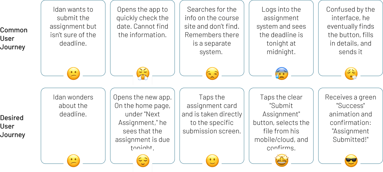
User Journey: Checking Assignment Deadline & Submission
Key Insights
Key insights that transformed the app from a useless tool into a supportive, personalized learning platform.
Following user analysis, market review, and understanding the core Persona, I synthesized four key insights that guided the redesign process:
1.
2.
3.
4.
The Solution
To approach the solution in a focused manner, I formulated key questions that guided the design process:
Goal #1
How might we turn the app from an "empty state" into a daily assistant?
Designed for immediate context, the Home Screen replaces menu clutter with a clear hierarchy based on urgency.
Goal #2
How might we visualize workload to reduce overwhelm?
Schedule
Visual Time Management

Forums
A vital feature that bridges the physical gap, transforming solitary remote study into a shared community experience.


Essential Info
The course's "ID card" Students can easily access vital technical details: course number, a permanent link to the lecture room, and contact the teaching staff.


Goal #3
How might we make essential information and documents instantly retrievable, eliminating the friction of endless menu navigation?
My profile
Centralizes all essentials grades, finance, documents, and inquiries into one clean, accessible hub.


Conclusion & Reflection
This project demonstrated that in remote education, good design is not just about aesthetics; it's an essential component of academic infrastructure.